The Salesforce Certified Tableau Data Analyst (Analytics-DA-201)
Passing Salesforce Tableau Data Analyst exam ensures for the successful candidate a powerful array of professional and personal benefits. The first and the foremost benefit comes with a global recognition that validates your knowledge and skills, making possible your entry into any organization of your choice.


Analytics-DA-201 Exam Dumps
- Exam Code: Analytics-DA-201
- Vendor: Salesforce
- Certifications: Tableau Data Analyst
- Exam Name: Salesforce Certified Tableau Data Analyst
Why CertAchieve is Better than Standard Analytics-DA-201 Dumps
In 2026, Salesforce uses variable topologies. Basic dumps will fail you.
| Quality Standard | Generic Dump Sites | CertAchieve Premium Prep |
|---|---|---|
| Technical Explanation | None (Answer Key Only) | Step-by-Step Expert Rationales |
| Syllabus Coverage | Often Outdated (v1.0) | 2026 Updated (Latest Syllabus) |
| Scenario Mastery | Blind Memorization | Conceptual Logic & Troubleshooting |
| Instructor Access | No Post-Sale Support | 24/7 Professional Help |
Customers Passed Exams
10
Success backed by proven exam prep tools
Questions Came Word for Word
86%
Real exam match rate reported by verified users
Average Score in Real Testing Centre
93%
Consistently high performance across certifications
Study Time Saved With CertAchieve
60%
Efficient prep that reduces study hours significantly
Salesforce Analytics-DA-201 Exam Domains Q&A
Certified instructors verify every question for 100% accuracy, providing detailed, step-by-step explanations for each.
Question 1
Salesforce Analytics-DA-201
QUESTION DESCRIPTION:
You are the owner of an alert.
You receive an email notification that the alert was suspended
From where can you resume the suspended alert?
Correct Answer & Rationale:
Answer: C
Explanation:
To resume a suspended alert, you need to go to the My Content area of Tableau web pages, where you can see all the alerts that you own or subscribe to. You can click on the alert name and then select Resume from the menu. You can also edit or delete the alert from there. References: https://help.tableau.com/current/pro/desktop/en-us/alerts.htm https://help.tableau.com/current/pro/desktop/en-us/alerts_manage.htm
In Tableau, the " My Content " area on the web interface is the place where a user can manage their content, including workbooks, data sources, and alerts. If an alert is suspended, the owner of the alert can go to the " My Content " area to resume it.
Question 2
Salesforce Analytics-DA-201
QUESTION DESCRIPTION:
You have the following line chart that shows the average sales by month.
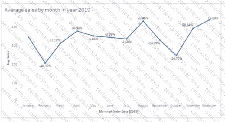
Which month had the biggest increase in swage sales compared to me previous month in 2019?
Correct Answer & Rationale:
Answer: D
Explanation:
Based on the line chart provided, each point on the line chart represents the average sales for a given month, and the percentage values indicate the change in average sales compared to the previous month. The month of November shows a significant increase from the month of October, indicated by a large upward spike on the chart and a high percentage increase.
Question 3
Salesforce Analytics-DA-201
QUESTION DESCRIPTION:
You have the Mowing dashboard.
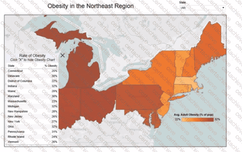
Which two elements are floating? Choose two.
Correct Answer & Rationale:
Answer: A, D
Explanation:
In Tableau dashboards, floating elements are those that can be freely moved over the dashboard canvas without being snapped into the tiled layout. The floating elements are often indicated by their standalone frames and the ability to overlap with other dashboard items. From the provided image, the state filter and the Rate of Obesity chart can be identified as floating if they can be moved independently of the tiled grid layout that constrains other elements.
Question 4
Salesforce Analytics-DA-201
QUESTION DESCRIPTION:
You want to connect a Tableau workbook to a dataset in a Microsoft Excel spreadsheet.
What should you do from Tableau Desktop?
Correct Answer & Rationale:
Answer: A
Explanation:
To connect a Tableau workbook to a dataset in a Microsoft Excel spreadsheet, you need to select New Data Source from the Data menu. This will open the Connect pane, where you can choose Microsoft Excel as your data source and browse for your spreadsheet file. You can then drag and drop your sheets or tables to join or union them in the data source page. References: https://help.tableau.com/current/pro/desktop/en-us/connect_basic.htm https://help.tableau.com/current/pro/desktop/en-us/connect_excel.htm
When connecting to a dataset in Tableau Desktop, you would go to the ' Data ' menu and select ' New Data Source ' . This allows you to connect to various types of data sources, including Microsoft Excel spreadsheets, where you can then select the specific file you wish to connect to.
Question 5
Salesforce Analytics-DA-201
QUESTION DESCRIPTION:
You have a database that includes field named sales, City and Region.
You have the following chart that shows the number of sales made in different cities.
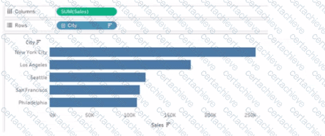
You want to dynamically show the corresponding region when users hover their mouse over any of the bars.
What should you do?
Correct Answer & Rationale:
Answer: D
Explanation:
To show the corresponding region when users hover their mouse over any of the bars, you need to drag Region to Tooltip on the Marks card. This will add Region as a field in the tooltip text that appears when users hover over a mark. You can also customize the tooltip text by editing it in the Tooltip dialog box. References: https://help.tableau.com/current/pro/desktop/en-us/buildmanual_shelves.htm https://help.tableau.com/current/pro/desktop/en-us/formatting_tooltips.htm
To show additional information such as the corresponding region when hovering over a bar in Tableau, you can drag the ' Region ' field to the ' Tooltip ' shelf on the ' Marks ' card. This will ensure that when a user hovers over a bar representing a city, the tooltip will dynamically display the region associated with that city.
Question 6
Salesforce Analytics-DA-201
QUESTION DESCRIPTION:
You publish a dashboard tut uses an attract. The extract refreshes every Monday at 10:00.
You need to ensure that the extract also refreshes on the last day of the month at 18:00.
What should you do?
Correct Answer & Rationale:
Answer: B
Explanation:
To refresh an extract on Tableau Server, you need to select the workbook, select Refresh Extracts, and then add a new extract refresh. You can specify the frequency and time of the refresh, as well as any custom options. You can have multiple extract refreshes for the same workbook with different schedules. References: https://help.tableau.com/current/server/en-us/refresh_extracts.htm https://help.tableau.com/current/server/en-us/refresh_extracts_add.htm
On Tableau Server, you can manage the scheduling of extract refreshes by selecting the specific workbook and configuring additional refresh schedules as needed. This allows for multiple refresh triggers, such as the regular Monday at 10:00 AM schedule, as well as an additional trigger for the last day of the month at 18:00.
Question 7
Salesforce Analytics-DA-201
QUESTION DESCRIPTION:
You have the following dashboard that contains two visualizations.
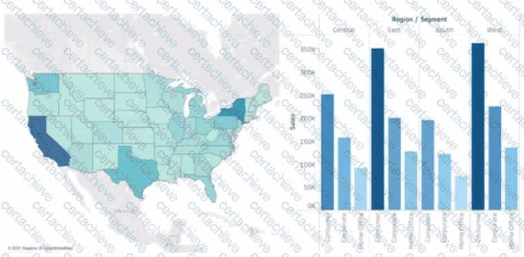
You want to show only one visualization at time. Users must be able to switch between visualizations.
What should you me?
Correct Answer & Rationale:
Answer: C
Explanation:
In Tableau, you can manage the visibility of different visualizations on a dashboard using various techniques. Among the options provided, the most straightforward method to allow users to switch between two visualizations is to use show/hide buttons.
Here ' s why each option is or isn’t suitable for the requirement:
A. A parameter and a calculated field: While it ' s possible to use a parameter and a calculated field to control which visualization is displayed, it requires creating a calculated field that responds to a parameter and then using that field to filter the view. This method can become complex and is not as user-friendly for simply showing and hiding visualizations.
B. Worksheet actions: Worksheet actions in Tableau typically allow users to interact with the data within a visualization, such as filtering data or highlighting related data points when clicking or hovering. They are not designed to control the visibility of entire visualizations on a dashboard.
C. Show/hide buttons: Show/hide buttons are a feature specifically designed to manage the visibility of dashboard elements. When you create a show/hide button, it can be configured to display or hide a particular visualization, container, or any other dashboard element when clicked. This provides a very intuitive interface for users to switch between visualizations.
D. Dashboard actions: Dashboard actions, like worksheet actions, are used to create interactions between sheets, such as filtering data or navigating to other sheets or URLs based on user interactions. They are not intended for toggling the visibility of visualizations.
Therefore, the correct answer is C. Show/hide buttons as they provide a user-friendly way to switch between visualizations on a dashboard without the need for complex calculations or actions that aren ' t meant for this purpose. The show/hide button feature is specifically designed for toggling visibility and offers a simple and effective solution for the requirement.
Question 8
Salesforce Analytics-DA-201
QUESTION DESCRIPTION:
You have a Tableau workbook.
You want to make the workbook available in Tableau Online.
What should you do?
Correct Answer & Rationale:
Answer: D
Explanation:
To make a workbook available in Tableau Online, you need to publish it from Tableau Desktop to Tableau Online. You can do this by selecting Publish Workbook from the Server menu, signing in to your Tableau Online account, choosing a project and a name for your workbook, and clicking Publish. This will upload your workbook and its data sources to Tableau Online, where you can view, edit, and share it with others. References:
Tableau Certified Data Analyst Exam Prep Guide , page 10, section “Publishing and Scheduling Data Refreshes”
Tableau Help: Publish a Workbook
Question 9
Salesforce Analytics-DA-201
QUESTION DESCRIPTION:
You have the following dashboard.
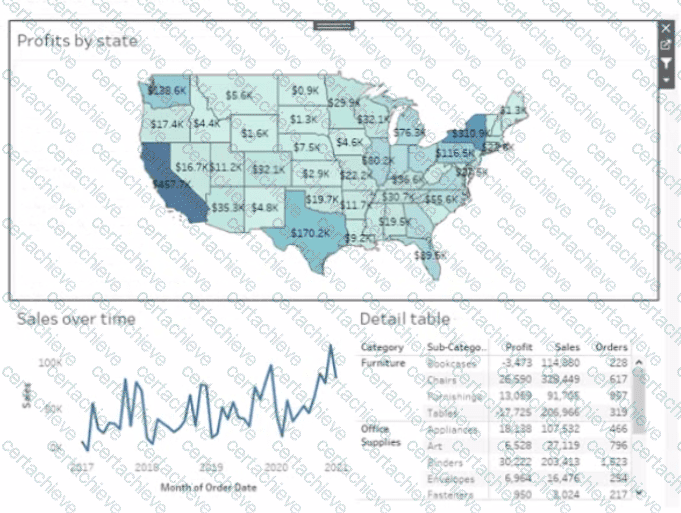
Currently the map is used as a filter that affects the data on the otter sheets of the dashboard
You need to configure the dashboard to ensure that selecting a data point on the map only tillers the Detail table
What should you do?
Correct Answer & Rationale:
Answer: A
Explanation:
To configure the dashboard to ensure that selecting a data point on the map only filters the Detail table, you should select Ignore Actions from the context menu of Sales over time. Ignore Actions is a feature that allows you to exclude a sheet from being affected by any actions on the dashboard, such as filters or highlights. You can select Ignore Actions by right-clicking on a sheet on the dashboard and selecting Ignore Actions from the menu.
In this case, you want to exclude Sales over time from being filtered by the map, so you should select Ignore Actions from its context menu. This will make Sales over time ignore any selections on the map and show all values. The Detail table will still be filtered by the map as usual.
The other options are not correct for this scenario. Removing Dashboard Item will delete Sales over time from the dashboard, which is not what you want. Deselecting Use as Filter will disable the map as a filter for any sheet on the dashboard, which is not what you want. Selecting Deselect will clear any selections on the map, but it will not prevent Sales over time from being filtered by future selections. References: https://help.tableau.com/current/pro/desktop/en-us/actions.htm https://help.tableau.com/current/pro/desktop/en-us/actions_ignore.htm
On a Tableau dashboard, when a map is used as a filter, it affects all other sheets in the dashboard by default. To restrict the filter action to only affect the Detail table and not the ' Sales over time ' chart, you would modify the action settings. By selecting " Ignore Actions " from the context menu of the ' Sales over time ' chart, it will no longer respond to the filtering action initiated by selecting data points on the map.
Question 10
Salesforce Analytics-DA-201
QUESTION DESCRIPTION:
You have the following table.
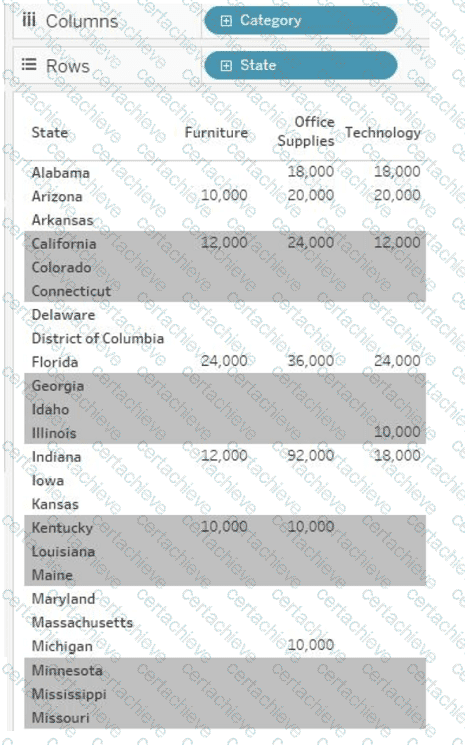
You need each record to alternate between grey and white.
What should you change in the Format Shading pane?
Correct Answer & Rationale:
Answer: A
Explanation:
To have each record alternate between grey and white, you should change the row banding size to 1 in the Format Shading pane. This setting will ensure that each row has a different shading from the one above and below it, creating an alternating pattern of grey and white rows. References: The answer can be verified through practical application within Tableau or by consulting Tableau’s official learning resources, such as Tableau Help: Format Shading or Tableau Training Pass: Formatting .

Verified by Certified Instructors
This Salesforce Analytics-DA-201 study pack was audited and verified on June 24, 2026 by Hilary Beaumont,. We ensure every technical rationale aligns with real-world enterprise standards.
A Stepping Stone for Enhanced Career Opportunities
Your profile having Tableau Data Analyst certification significantly enhances your credibility and marketability in all corners of the world. The best part is that your formal recognition pays you in terms of tangible career advancement. It helps you perform your desired job roles accompanied by a substantial increase in your regular income. Beyond the resume, your expertise imparts you confidence to act as a dependable professional to solve real-world business challenges.
Your success in Salesforce Analytics-DA-201 certification exam makes your visible and relevant in the fast-evolving tech landscape. It proves a lifelong investment in your career that give you not only a competitive advantage over your non-certified peers but also makes you eligible for a further relevant exams in your domain.
What You Need to Ace Salesforce Exam Analytics-DA-201
Achieving success in the Analytics-DA-201 Salesforce exam requires a blending of clear understanding of all the exam topics, practical skills, and practice of the actual format. There's no room for cramming information, memorizing facts or dependence on a few significant exam topics. It means your readiness for exam needs you develop a comprehensive grasp on the syllabus that includes theoretical as well as practical command.
Here is a comprehensive strategy layout to secure peak performance in Analytics-DA-201 certification exam:
- Develop a rock-solid theoretical clarity of the exam topics
- Begin with easier and more familiar topics of the exam syllabus
- Make sure your command on the fundamental concepts
- Focus your attention to understand why that matters
- Ensure hands-on practice as the exam tests your ability to apply knowledge
- Develop a study routine managing time because it can be a major time-sink if you are slow
- Find out a comprehensive and streamlined study resource for your help
Ensuring Outstanding Results in Exam Analytics-DA-201!
In the backdrop of the above prep strategy for Analytics-DA-201 Salesforce exam, your primary need is to find out a comprehensive study resource. It could otherwise be a daunting task to achieve exam success. The most important factor that must be kep in mind is make sure your reliance on a one particular resource instead of depending on multiple sources. It should be an all-inclusive resource that ensures conceptual explanations, hands-on practical exercises, and realistic assessment tools.
Certachieve: A Reliable All-inclusive Study Resource
Certachieve offers multiple study tools to do thorough and rewarding Analytics-DA-201 exam prep. Here's an overview of Certachieve's toolkit:
Salesforce Analytics-DA-201 PDF Study Guide
This premium guide contains a number of Salesforce Analytics-DA-201 exam questions and answers that give you a full coverage of the exam syllabus in easy language. The information provided efficiently guides the candidate's focus to the most critical topics. The supportive explanations and examples build both the knowledge and the practical confidence of the exam candidates required to confidently pass the exam. The demo of Salesforce Analytics-DA-201 study guide pdf free download is also available to examine the contents and quality of the study material.
Salesforce Analytics-DA-201 Practice Exams
Practicing the exam Analytics-DA-201 questions is one of the essential requirements of your exam preparation. To help you with this important task, Certachieve introduces Salesforce Analytics-DA-201 Testing Engine to simulate multiple real exam-like tests. They are of enormous value for developing your grasp and understanding your strengths and weaknesses in exam preparation and make up deficiencies in time.
These comprehensive materials are engineered to streamline your preparation process, providing a direct and efficient path to mastering the exam's requirements.
Salesforce Analytics-DA-201 exam dumps
These realistic dumps include the most significant questions that may be the part of your upcoming exam. Learning Analytics-DA-201 exam dumps can increase not only your chances of success but can also award you an outstanding score.
Top Exams & Certification Providers
New & Trending
- New Released Exams
- Related Exam
- Hot Vendor